my brand
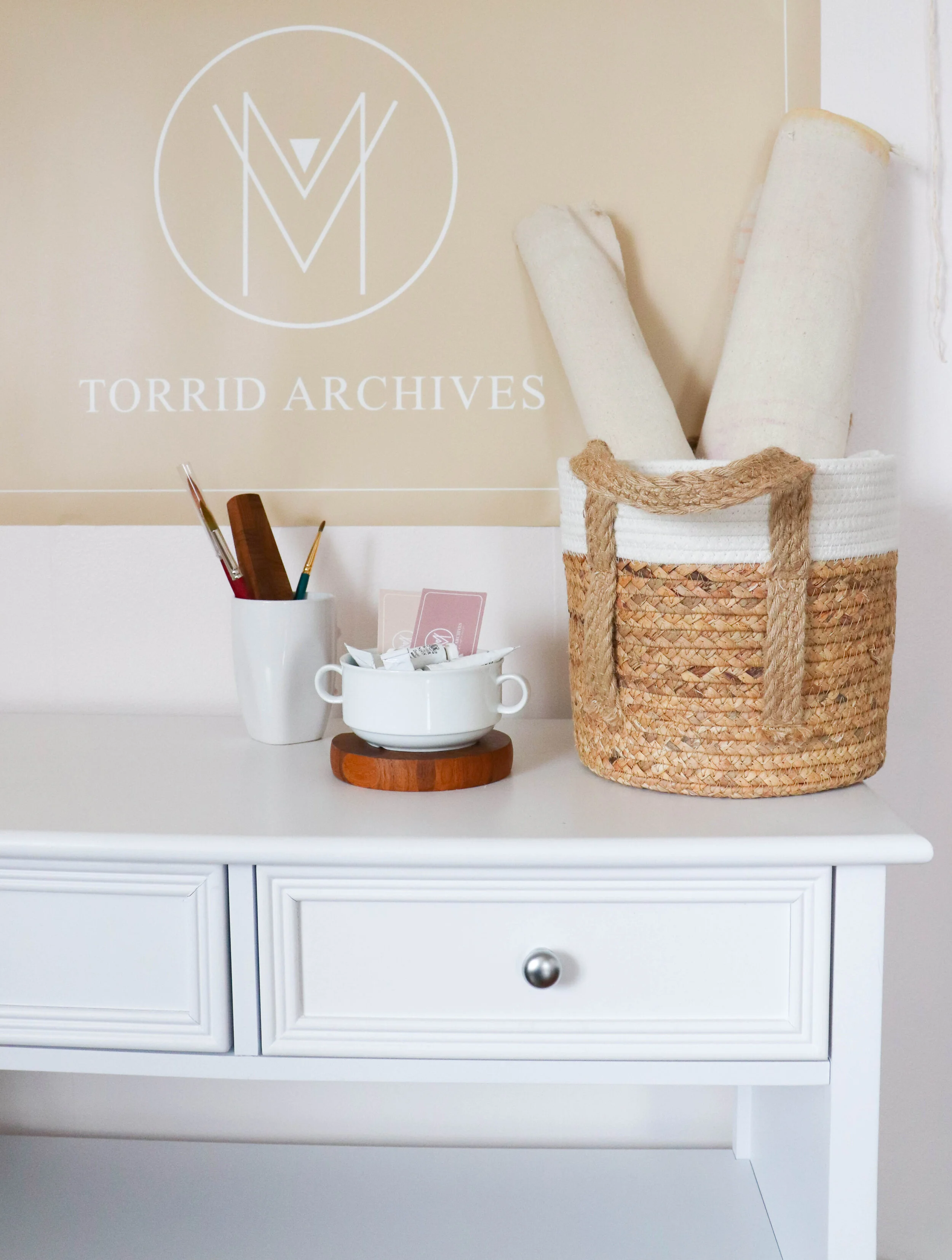
The name of my business is taken from my own name. When I had learned Torrid was an actual word, I looked it up and saw passionate and that was enough for me. I have more than one talent and create more than one type of artwork, so i chose the word “Archives” because it means a collection of historical documents. These documents aren’t currently historical, in fact they are mostly incredibly contemporary, but that won’t be the case forever and I want my artwork to mark it’s place when it is inevitably history.
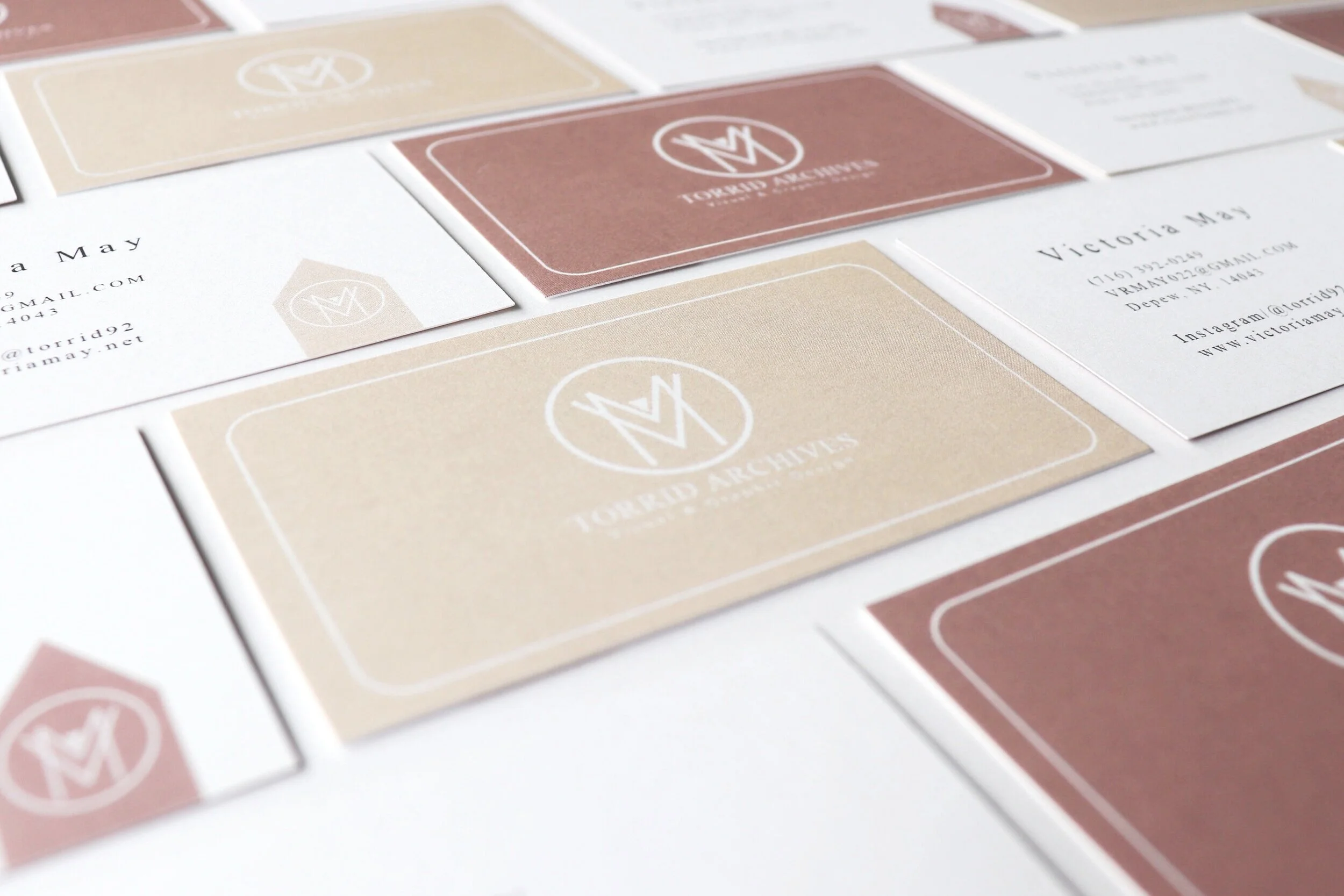
Business Cards
I intend to be authentically transparent. Naturally me, never fake or vague, always practical and intuitive. I practice this in everyday life as well as doing business, so I needed my logo and color scheme to match this philosophy.
I chose a mostly geometric logo that bears my initials, the circle reflects unity and connection. The circle, or transparent “Orb” is reflected in many pieces of my artwork to symbolize a layer of protection, concealment or entrapment depending on the context.
The colors Nude and Mauve are not only representative of the contemporary design world, but they are the colors of my skin, my natural physical being. Reflecting a simple and straightforward approach to business and personal relationships is important to me.


